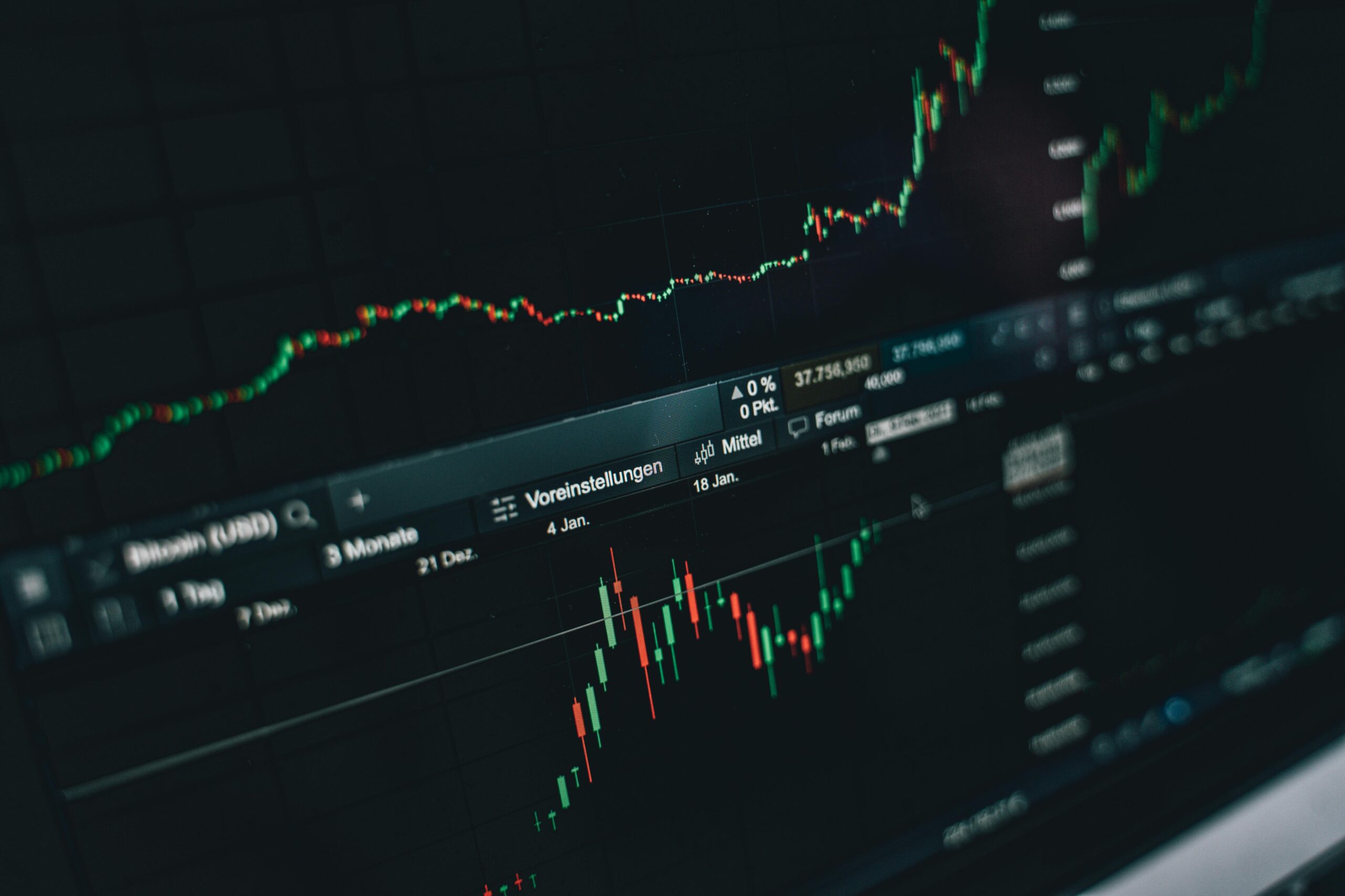
Understanding where your money goes is the first step toward financial freedom. Visual spending patterns transform complex data into actionable insights that help you make smarter decisions.
💡 Why Visual Data Revolutionizes Money Management
Our brains process visual information 60,000 times faster than text. This biological fact explains why staring at spreadsheets filled with numbers rarely leads to lasting behavioral change. When you convert your spending data into visual patterns—charts, graphs, and color-coded categories—you create an immediate emotional and cognitive connection with your financial reality.
Traditional budgeting methods often fail because they require too much mental energy to interpret. You might look at a bank statement showing dozens of transactions and feel overwhelmed. But when that same data appears as a pie chart showing that 40% of your income goes to dining out, the impact is immediate and undeniable.
Visual spending patterns act as a mirror for your financial habits. They reveal the gap between how you think you spend money and how you actually spend it. This awareness gap is where transformation begins. Many people believe they spend moderately on entertainment or clothing, only to discover through visual analysis that these categories consume far more than anticipated.
🎯 The Psychology Behind Pattern Recognition
Humans are pattern-seeking creatures. Our ancestors survived by recognizing patterns in nature—which plants were poisonous, when predators hunted, where water could be found. This same neurological wiring makes us exceptionally good at spotting trends in visual data, but relatively poor at extracting insights from raw numbers.
When you visualize your spending over time, you engage multiple cognitive processes simultaneously. Your visual cortex identifies shapes and colors, your pattern recognition systems spot trends and anomalies, and your emotional centers react to what you see. This multi-layered engagement creates stronger memory formation and motivates behavioral change more effectively than reading text-based reports.
Research in behavioral economics shows that people who regularly review visual representations of their spending reduce unnecessary expenses by an average of 23% within the first three months. The visibility creates accountability, and accountability drives action.
📊 Essential Visual Tools for Spending Analysis
Different visualization methods reveal different insights. Mastering a variety of visual tools ensures you capture the complete picture of your financial behavior.
Pie Charts: Understanding Proportional Spending
Pie charts excel at showing how your total spending divides across major categories. At a glance, you can see whether housing, transportation, food, or discretionary spending dominates your budget. The immediate visual weight of each slice communicates priority and proportion better than any numerical list.
Use pie charts when you need to answer questions like: “What percentage of my income goes to fixed versus variable expenses?” or “How much of my discretionary spending goes to entertainment versus shopping?”
Line Graphs: Tracking Trends Over Time
Line graphs reveal temporal patterns that pie charts cannot. They show whether your spending in specific categories is increasing, decreasing, or remaining stable. You might discover that your grocery spending spikes predictably every holiday season, or that your utility bills follow seasonal patterns you can plan for.
Time-based visualization helps you identify spending creep—the gradual increase in expenses that happens so slowly you don’t notice it month-to-month. When plotted over six or twelve months, that $10 monthly increase in subscription services becomes clearly visible and actionable.
Bar Charts: Comparing Categories and Time Periods
Bar charts facilitate comparison. You can place spending categories side-by-side to see which demands the most resources, or compare the same category across different months to spot unusual variations. This comparative power makes bar charts ideal for budget-versus-actual analysis.
Many people find success using bar charts to compare their spending against benchmarked averages for their income level. Seeing that you spend twice the national average on a particular category creates powerful motivation for adjustment.
Heat Maps: Identifying Spending Hotspots
Heat maps use color intensity to show concentration patterns. In spending analysis, they might display which days of the week or times of the month see the highest transaction volumes. You might discover that you overspend consistently on Fridays after work, or that the week following payday shows less discipline than other periods.
This granular insight allows for strategic intervention. If Friday evenings trigger impulse spending, you can plan alternative activities or implement cooling-off periods before making purchases on those specific days.
🔍 Building Your Visual Spending Dashboard
Creating an effective visual spending system requires more than downloading an app—it demands thoughtful setup and customization to match your financial goals and lifestyle.
Categorization: The Foundation of Clarity
Before any visualization can help you, your transactions need accurate categorization. Most banking apps and financial tools offer automatic categorization, but default categories rarely match individual circumstances perfectly.
Customize your categories to reflect your actual decision-making structure. Instead of a generic “Food” category, consider splitting it into “Groceries,” “Restaurants,” “Coffee Shops,” and “Fast Food.” This granularity reveals which food-related expenses truly add value to your life versus which are mindless habits.
Create categories that align with your values and goals. If you’re trying to build a home, having a dedicated “House Fund” category makes that progress visually trackable. If health is a priority, separate “Medical,” “Fitness,” and “Wellness” categories help you ensure adequate investment in this area.
Automation: Reducing Manual Effort
Manual data entry kills consistency. The most successful visual spending systems connect directly to your financial accounts, automatically importing and categorizing transactions. This automation ensures your visual dashboards stay current without requiring constant attention.
Modern banking apps increasingly offer built-in visualization tools. Many provide spending breakdowns, trend analysis, and customizable alerts. For more sophisticated analysis, dedicated personal finance applications offer deeper functionality and multi-account aggregation.
Frequency: Establishing Review Rhythms
Visual tools only generate insights when you actually look at them. Establish a regular review schedule that matches your financial complexity and goals. For most people, a comprehensive weekly review supplemented by quick daily check-ins creates optimal awareness without becoming burdensome.
Weekly reviews should take 15-20 minutes and cover: reviewing spending by category, comparing actual spending to budgeted amounts, identifying unusual transactions or trends, and adjusting upcoming week’s plans based on current status. Daily check-ins might involve just 2-3 minutes confirming that yesterday’s transactions categorized correctly and checking your remaining discretionary budget.
💰 Actionable Insights from Visual Patterns
Visualization without action wastes time. The true power of visual spending patterns emerges when you systematically convert observations into behavior changes.
The 80/20 Spending Rule
Visual analysis typically reveals that 80% of your spending optimization opportunity concentrates in 20% of your categories. Rather than trying to micromanage every expense, focus intensive attention on the high-impact categories your visualizations highlight.
If your charts show that dining out represents 30% of your discretionary spending, reducing restaurant visits by just 25% yields more savings than eliminating an entire smaller category. Visual patterns help you prioritize efforts where they’ll generate maximum return.
Spotting Subscription Creep
Monthly line graphs excel at revealing subscription accumulation. That $10 here and $15 there adds up, but because each charge is relatively small, they escape attention. When plotted visually over time, you see the staircase pattern of increasing fixed expenses as new subscriptions stack on top of existing ones.
Conduct a quarterly subscription audit using your visual tools. List every recurring charge, evaluate whether you actively use each service, and ruthlessly eliminate anything that doesn’t deliver clear value. Many people discover they’re paying for multiple services that provide redundant functionality, or maintaining subscriptions to services they tried once and forgot to cancel.
Seasonal Planning Through Historical Patterns
Year-over-year comparisons reveal seasonal spending patterns that help you plan more effectively. If your data shows that December consistently costs 40% more than average months, you can prepare by increasing savings in September through November or adjusting expectations for other categories during the holiday season.
This historical insight transforms unexpected expenses into expected ones. Instead of feeling financial stress every time property taxes come due or when back-to-school shopping arrives, your visual patterns help you anticipate and prepare for these predictable variations.
🎨 Color Psychology in Financial Visualization
The colors you choose for your spending categories aren’t merely aesthetic—they influence how you perceive and react to your financial data. Strategic color selection enhances the psychological impact of your visual systems.
Red naturally signals caution and overspending. Use red for categories where you consistently exceed budget or for discretionary expenses you’re trying to reduce. The negative association your brain has with red creates subtle motivation to keep those categories smaller.
Green represents growth, health, and positive outcomes. Apply green to savings categories, investment contributions, and areas where you want to increase spending (like education or health). The positive association reinforces these financial behaviors.
Blue conveys stability and necessity. It works well for fixed expenses like housing, insurance, and utilities—categories that require reliable management but don’t need emotional motivation for change.
Yellow and orange draw attention without the negative connotation of red. Use these colors for variable expenses that need monitoring but aren’t necessarily problematic—categories like groceries or transportation where you want awareness without judgment.
📱 Mobile Accessibility and Real-Time Decisions
The most effective visual spending systems accompany you throughout the day, providing real-time context for purchasing decisions. Mobile accessibility transforms how you engage with your financial data.
Before making a discretionary purchase, quickly checking your visual dashboard answers critical questions: Have I already spent significantly in this category this month? Will this purchase push me over budget? How does this expense align with my current priorities?
This point-of-sale reference creates a pause between impulse and action. Research shows that even a 30-second delay combined with relevant information reduces impulse purchases by up to 40%. Your visual spending tools provide both the pause and the information.
Push notifications based on visual thresholds add another layer of awareness. You might set alerts when any discretionary category reaches 75% of budget, or when your daily spending exceeds a predetermined average. These gentle reminders keep financial consciousness elevated without requiring constant manual checking.
🚀 Advanced Techniques for Power Users
Once you’ve mastered basic visual spending analysis, advanced techniques unlock deeper insights and more sophisticated optimization strategies.
Spending Velocity Analysis
Rather than just tracking total spending, analyze the rate of spending within budget periods. A velocity chart shows whether you’re spending evenly throughout the month or front-loading expenses. Front-loaded spending creates risk—if an unexpected expense arises late in the month, you lack flexibility because funds are already committed.
Visualizing spending velocity helps you develop more balanced consumption patterns and maintain financial reserves throughout the entire budget period rather than running dry before the next income arrives.
Correlation Mapping
Advanced users map correlations between different spending categories and external factors. You might discover that high stress weeks correlate with increased takeout food spending, or that social media usage correlates with online shopping expenses. These correlation visualizations reveal triggers that drive spending behavior.
Once you identify correlations, you can address root causes rather than just symptoms. If stress drives food spending, developing better stress management techniques addresses the underlying issue more effectively than simply trying to restrict food purchases through willpower alone.
Scenario Modeling
Use your historical visual data to model potential scenarios. What would your financial picture look like if you reduced dining out by 50%? How would eliminating your car payment change your discretionary spending capacity? Visual scenario modeling helps you evaluate major financial decisions with concrete data rather than abstract guesses.
Create comparison views showing your current trajectory versus your desired trajectory. The visual gap between where you’re headed and where you want to go creates clarity about required changes and motivation to implement them.
🌟 Transforming Insights into Lasting Habits
Visual patterns accelerate insights, but insights alone don’t create change. The final step involves converting what you learn into sustainable habits that improve your financial trajectory permanently.
Implementation Intentions
When your visual analysis reveals an area for improvement, create specific implementation intentions: “When [situation] occurs, I will [specific action].” For example, if visualizations show excessive coffee shop spending, your implementation intention might be: “When I want coffee after 10am, I will make coffee in the office kitchen instead of visiting the café.”
Implementation intentions work because they pre-decide actions before you’re in the moment of temptation. Your visual spending patterns identify which situations need implementation intentions, making your habit formation efforts strategic rather than random.
Progress Visualization
Beyond analyzing spending, create visual representations of your progress toward goals. If you’re building an emergency fund, maintain a progress bar that fills as you approach your target. If you’re reducing debt, graph the declining balance over time.
Progress visualization leverages the psychological principle of momentum. Seeing visual progress motivates continued effort, while the absence of visual tracking allows motivation to fade. Your brain responds powerfully to visible achievement, releasing dopamine that reinforces positive financial behaviors.
Sharing and Accountability
Consider sharing your visual spending patterns with an accountability partner or financial community. The social dimension adds another layer of motivation. Knowing that someone else will see your charts creates gentle pressure to maintain standards and follow through on commitments.
Many people find that couples benefit tremendously from shared visual dashboards. Rather than having abstract money conversations, you discuss concrete visual data. This objectivity reduces emotional conflict and focuses attention on solving problems rather than assigning blame.

🎯 Your Visual Financial Future Starts Today
The gap between your current financial reality and your desired financial future narrows when you can see it clearly. Visual spending patterns provide that clarity, transforming abstract concerns into concrete, actionable information.
Begin today by choosing one visualization method and applying it to just one spending category. Perhaps create a simple pie chart showing how last month’s income divided across major categories, or graph your discretionary spending over the past three months. This small start builds momentum.
As you develop comfort with visual analysis, gradually expand your system’s sophistication. Add more visualization types, increase automation, establish regular review rhythms, and systematically convert insights into action. Each incremental improvement compounds, creating increasingly powerful awareness and control.
Remember that perfection isn’t the goal—progress is. Your visual spending system will evolve as your needs and goals change. What matters is maintaining consistent engagement with your financial data through visual tools that make patterns obvious and decisions easier.
The money you earn represents your life energy—hours of work, skill development, and effort. Visual spending patterns ensure that life energy aligns with your values and moves you steadily toward your definition of financial success. When you can see where your money goes, you gain the power to direct it purposefully rather than wondering where it went.
Toni Santos is a behavioral finance researcher and decision psychology specialist focusing on the study of cognitive biases in financial choices, self-employment money management, and the psychological frameworks embedded in personal spending behavior. Through an interdisciplinary and psychology-focused lens, Toni investigates how individuals encode patterns, biases, and decision rules into their financial lives — across freelancers, budgets, and economic choices. His work is grounded in a fascination with money not only as currency, but as carriers of hidden behavior. From budget bias detection methods to choice framing and spending pattern models, Toni uncovers the psychological and behavioral tools through which individuals shape their relationship with financial decisions and uncertainty. With a background in decision psychology and behavioral economics, Toni blends cognitive analysis with pattern research to reveal how biases are used to shape identity, transmit habits, and encode financial behavior. As the creative mind behind qiandex.com, Toni curates decision frameworks, behavioral finance studies, and cognitive interpretations that revive the deep psychological ties between money, mindset, and freelance economics. His work is a tribute to: The hidden dynamics of Behavioral Finance for Freelancers The cognitive traps of Budget Bias Detection and Correction The persuasive power of Choice Framing Psychology The layered behavioral language of Spending Pattern Modeling and Analysis Whether you're a freelance professional, behavioral researcher, or curious explorer of financial psychology, Toni invites you to explore the hidden patterns of money behavior — one bias, one frame, one decision at a time.


